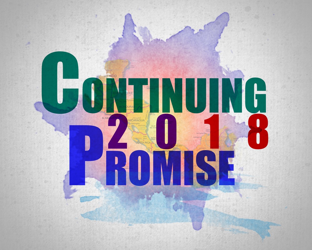
This logo was created when I was assigned to the Continuing Promise 2018 public affairs team. I thought it was important to distinguish our mission from all those that had come before us and decided that in order to do so we needed a unique brand and a memorable slogan. The concept of the design, and ultimately the graphic theme in all of our products, was water colors. I arrived at this when I considered what happens when the blue water Navy meets the vibrant colors of Central and South America. The map underlay features the countries we were to visit. The CP18 was intended to be more cryptic than spelling out Continuing Promise 2018. That way, I hoped, people would look into it themselves if they saw it enough. The green of the “C” represents the jungle canopy of Central America as well as our Army contingent. The blue of the “P” symbolizes the blue in each country’s flag. The red of the “1” pays homage to the red in the U.S. flag and the purple “8” refers to the joint nature of the mission. Below CP18 is our slogan “Changing Lives” in a complimentary font. I decided on this phrase because it was the simplest, most direct and memorable way to express our mission objective. The logo was used in all of our products and even the commodore’s letterhead. It was projected on the wall of the HQ tent around the clock and a high school in Honduras asked to us to paint an 8-foot mural of it on the wall of their gymnasium. The slogan became the rallying cry of the mission and was used to close out every quarters.
| Date Taken: | 02.18.2018 |
| Published: | 08-30-18 11:37 AM |
| Graphic ID: | 3014 |
| VIRIN: | 180218-N-UP035-0003 |
| Size: | 2.61 MB |
| Location: |
| Web Views: | 5 |
| Downloads: | 1 |

This work, Continuing Promise 2018 Logo Variant, by CPO Mike DiMestico, identified by DVIDS, must comply with the restrictions shown on https://www.dvidshub.net/about/copyright.