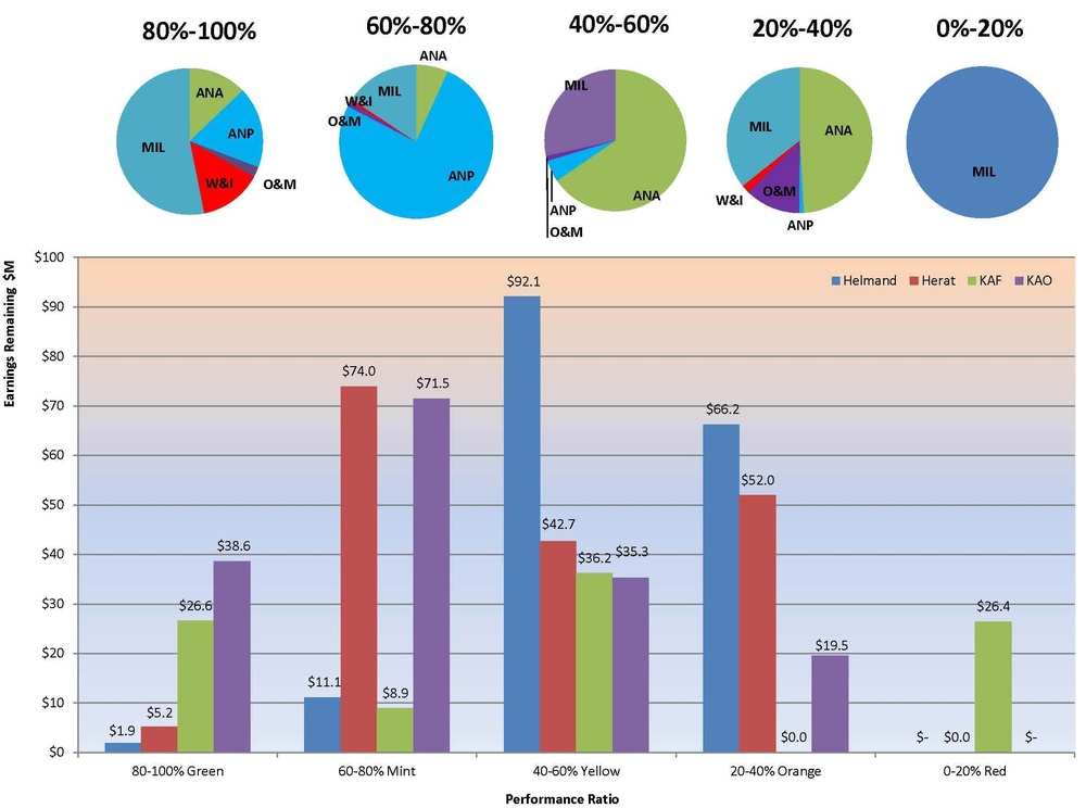
The pie charts show the types of projects in each performance quintile. The bar chart shows how each area office is performing — the percentage is the ratio of actual versus scheduled progress, while the dollar figure is the total remaining value of contracts in that performance range.
| Date Taken: | 01.20.2012 |
| Date Posted: | 01.21.2012 05:16 |
| Photo ID: | 512584 |
| VIRIN: | 120120-A-CE099-001 |
| Resolution: | 2050x1525 |
| Size: | 148.5 KB |
| Location: | KANDAHAR AIRFIELD, AF |
| Web Views: | 98 |
| Downloads: | 3 |

This work, Charts showing contract performance across the USACE Afghanistan Engineer District South [Image 3 of 3], by Marcus Spade, identified by DVIDS, must comply with the restrictions shown on https://www.dvidshub.net/about/copyright.